Design


- Category: tạp chí
- Hits: 721
Đây là 1 trong những thứ tôi "ngộ" ra mức độ quan trọng của nó sau khi đã biết dàn trang từ rất lâu

- Category: tạp chí
- Hits: 635
Một trong những thứ cơ bản nhưng không dễ học được, đó là tạo dàn trang 2 cột + cột phụ
- Category: tạp chí
- Hits: 390
Khi đã có 1 layout đẹp mà bạn nhận data quá nhiều
Thêm trang
giảm text
ghép nội dung
- Category: tạp chí
- Hits: 492
Rất nhiều trường hợp chúng ta thấy chủ thể đè lên masthead như muốn nhô ra ngoài bìa sách
- Category: tạp chí
- Hits: 556
Masthead, còn gọi là manchette, được xem như là logo của tạp chí
- Category: tạp chí
- Hits: 763
Yếu tố quan trọng nhất của bìa tạp chí là main image
- Category: tạp chí
- Hits: 463
Bìa tạp chí cần được đầu tư, chăm chút tối đa vì đây là yếu tố lôi kéo người mua
- Category: tạp chí
- Hits: 919
Lorem ipsun là gì? và khi nào chúng ta cần text tạm?
- Category: tạp chí
- Hits: 835
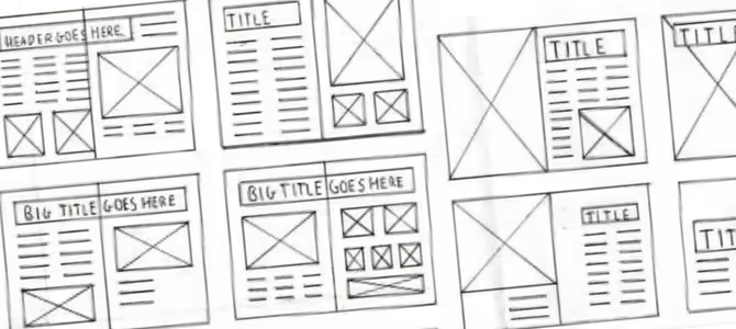
Bài này sẽ bắt đầu loạt bài thiết kế tạp chí
10 yếu tố chính trong thiết kế layout magazine
Unpublished- Category: tạp chí
- Hits: 414
WHAT ARE THE 10 KEY ELEMENTS OF A MAGAZINE LAYOUT DESIGN?
The global magazine publishing industry is worth $100bn and still growing! This reinstates the fact that magazines are very much popular and read by a sizeable audience, which further calls for the need of effective magazine layout designs. Designing the layout of a magazine on a regular basis can be challenging, especially if a publishing company is not aware of the 10 most important elements of a magazine page. If you plan to publish a magazine for your or your client's business, following article can help you.

10 Most Important Elements of Magazine Designing
There are several important elements in a magazine layout, such as headline, image, image caption, running head, byline, subhead, body copy, etc. Here, we look into the ten most crucial elements of a magazine layout.
-
Headline
It is the most important element of a magazine layout design. It can be of various sizes, but should be set in a size bigger than the other text elements in the page. A headline should be interesting, meaningful and compelling enough as it increases the chances of an article to be read.
-
Introductory Paragraph
Also known as "intro" "kicker", "deck" or "stand-first", an introductory paragraph is the main piece of content that introduces a reader to an article. It carries forward what a headline has succeeded in doing - catching the attention of a reader. It connects a reader to the main article, taking forward a reader's journey into the midst of the article.
It sets the tone of the article for a reader and sometimes, also summarizes the entire article. In terms of font size, it should be smaller than the font size of the headline of an article. But, it should be slightly bigger or at least a little bolder than the rest of the article.
-
Body / Body Text / Body Copy
This is a more lengthy and detailed part of a magazine article when compared to the introductory paragraph of the heading / headline of an article. A well-written body copy keeps a reader engaged to an article for the most part, generally till the end of the article.
When one begins to design the magazine layout template, they should begin with designing the body copy of an article, because that takes maximum space, running into multiple paragraphs. It is important that you set the right margins in terms of columns and rows to improve readability. A key point to note here is that you should be consistent with the length of the body copy for all the articles in the magazine.
-
Bylines
It is important that you acknowledge the person and the team which has worked on an article. Usually, the author's name is written under the headline of the article, which is also known as the byline. It can be written in the same font size as that of the body copy.
-
Sub-headline / Subhead
These are used to break an article into various sections or compartments, indicating what the next set of paragraphs is going to talk about. It can be written in the same font in which the body copy is written, but it should stand out from the body copy at the same time. Hence, you can keep it "bold" so that it looks like a mini-heading or headline. An important thing to bear in mind is that you should not place subheads below an image or a quote in an article.
-
Pull Quotes
These usually provide a different dimension to an article in a magazine, making it look more interesting. Quotes aid in conveying your story to a reader, and if coupled with images, become potent. You can either have a quote verbatim from a portion of the body copy, or you could perhaps summarize a few points of the body copy in different words and have them as a quote or an excerpt. Ideally, the quotes or excerpts or blurbs should be in a font that is different from the font in which the body copy has been written.
-
Captions for Images
These should be written in a way that they complement the image being used in an article. A caption should describe an image and should ideally be placed immediately below the image. The font size for image captions can be the same as that of the font in which the body copy has been written or slightly smaller than that.
-
Section Head / Running Head
Every magazine article does not need a running head, but some do. These are usually placed at the top of every page of a magazine and aid readers in navigating through an article easily. A running head should be designed creatively so that it looks good, because it is present on almost all pages of the magazine and a reader sees it every now and then. So, it has to be visually attractive.
-
Folio
It should be designed in such a way that you do not annoy a reader who looks into it on almost every page of a magazine. It is a way of arranging sheets of papers in your magazine, by folding them in a certain manner. You should tread with caution especially when you have many pages in your magazine containing full bleed images. A reader could be annoyed if you place folios on those pages.
-
Box Copy / Panel
Such boxes contain important facts related to the topic of the article that a reader should know while reading a magazine article. These could be statistics or dates or anything factual in nature which is important to know and short in length. Such data is placed in a box to catch the attention of a reader. A box can have a dedicated heading as well.
- Category: typo
- Hits: 65
Principles of Typography
The principles of typography follow a set of guidelines and principles that ensures any typefaces used are harmonious with each other and other design elements. These principles include:
- Legibility: is the readability of a typeface and emphasizes the importance of selecting appropriate typefaces and sizes for different contexts.
- Hierarchy: helps to guide readers' attention by using variations in size, weight, and style to establish a clear visual order.
- Alignment: ensures that type is visually aligned and organized, whether it's left-aligned, right-aligned, centered, or justified.
- Contrast: created by combining different typefaces, sizes, weights, and colors to add visual interest and differentiate between different levels of information.
- Proper spacing: includes leading, kerning, and tracking, ensures readability and prevents overcrowding or excessive gaps between letters and lines.
- Consistency: ensures that typographic elements are applied consistently throughout a design, contributing to a cohesive and unified visual identity.
Chữ trung tính
Unpublished- Category: typo
- Hits: 340
Chữ trung tính là các typeface ưu tiên tính rõ ràng
- Category: typo
- Hits: 389
Các ý tưởng trang trí 1 tiêu đề 2 chữ với line
- Category: typo
- Hits: 416
Phương pháp kết hợp nhiều font chữ khác nhau trong thiết kế
- Category: typo
- Hits: 323
Khi nào không nên dùng chữ in nghiêng
Khi muốn thể hiện sự trang trọng, nghiêm túc. Ví dụ các chữ tiêu đề lớn trong các sách báo khoa học, tin tức như tên chương sách

Lỗi chữ mồ côi và dòng goá phụ
Unpublished- Category: typo
- Hits: 558
Phân biệt lỗi Runt, Widow và orphans
Dot grid - Thiết kế chữ
Unpublished- Category: typo
- Hits: 394

- Category: typo
- Hits: 459
Readability (tính rõ ràng) và Legibility (tính dễ đọc) là 2 trong những tính chất cơ bản nhất của người dùng chữ

- Category: typo
- Hits: 560
⌈40 Beautiful and Inspiring Typographic Quotes⌋ - Chúng ta được nhắc nhở thường xuyên về vai trò Typography quan trọng như thế nào trong mọi phương diện Thiết kế - mà thể hiện thực tế đó là những văn bản đẹp, bắt mắt.

- Category: typo
- Hits: 600
Bộ sưu tập các kiểu chữ trên 102 mẫu áo
- Category: typo
- Hits: 538
Như chúng ta đã biết, khoảng cách giữa 2 hàng đẹp nhất là 120% so với chiều cao 1 dòng. Thế nhưng tại sao trong các phần mềm đồ hoạ lại là (14.4pt)
- Category: typo
- Hits: 379
Lịch sử Typography phần 2

- Category: typo
- Hits: 743
Tôi thích NGHỆ THUẬT CHỮ (typography) và tôi đã được học qua về nó trong thời kỳ đại học. Tuy nhiên, khi được nhận trách nhiệm nghiên cứu và giảng dạy thì tôi thấy những gì học được không là gì so với thế giới kỳ thú của chữ viết.
History and Evolution of Typography
Unpublished- Category: typo
- Hits: 370
History and Evolution of Typography
Lồng hình vào chữ
Unpublished- Category: typo
- Hits: 379
Thủ thuật này tương đối đơn giản nhưng khá ấn tượng.
- Category: typo
- Hits: 416
Illustrator Jose Daniel Cabrera Peña paints an image of conflict from Greek mythology.
illustrator - Tạo font chữ
Unpublished- Category: typo
- Hits: 359
Dịch từ bài How to Build a Font in Adobe Illustrator (Steve Caplin)

- Category: typo
- Hits: 629
Đối với người nghiên cứu, khi tìm được 1 tài liệu quý, giống như tìm được 1 cánh cửa thần kỳ. Chúng ta có thể sử dụng cách nói như vậy đối với tài liệu dưới đây.
Thiết kế 1 typeface
Unpublished- Category: typo
- Hits: 342
Tạo 1 typeface mới thì bắt đầu từ những ký tự nào?
Tất nhiên bạn k thể tạo riêng lẻ từng ký tự trong 26 ký tự được, vì như thế thì nguy cơ các ký tự không tương thích nhau
Với chữ HOA
Với chữ thường
Chuyển typeface thành font
Chuyển bằng phần mềm
Chuyển bằng website
các trang web tạo font trực tuyến
https://www.glyphrstudio.com/

- Category: typo
- Hits: 580
Khái quát về các yếu tố hình thành typeface

- Category: typo
- Hits: 1416
Chuyên trang các thuật ngữ tiếng Anh chuyên ngành Typography
- Category: typo
- Hits: 625
Bài này là 1 trong loạt bài về Typography hiện đại, hấp dẫn
bootstrap
Unpublished- Category: Web
- Hits: 330
container và container-fluid
Khi sử dụng class="container" nghĩa là chúng ta đang dùng hệ thống grid 12 cột
- container-fluid: width 100%
- container: with = 12 columns
gutter
Một cột nằm giữa
<div class="row justify-content-center"> One centered column
<div class="col-4"> </div>
</div>
Nguồn:
https://mdbootstrap.com/docs/standard/navigation/breadcrumb/
- Category: Web
- Hits: 531
Trước khi upload trên server, bạn nên cài đặt bộ source CMS vào local trước để kiểm tra tính ổn định
Raster Article Count: 29

vector y Article Count: 3
typo Article Count: 13

Web Article Count: 18
Visual Studio Article Count: 2
- Trang online - https://vscode.dev
- Trang download - https://code.visualstudio.com
- Trang hướng dẫn - https://code.visualstudio.com/docs/?dv=osx